Here is the finished result of my final film.
Thursday, 10 May 2012
Thursday, 1 March 2012
Ancillary Tasks
Digipack
After my research of digipacks, I noticed that artists of my genre, indie, used simple themes for their digipacks, like Kate Nash or Robyn's. I wanted to have a concept that reflected the theme of the songs I had used for my music video, which was very naturalistic.
Having looked at The Horror's digi-pack, I was inspired by their retro and vibrant look and their clear links to nature.


I was also inspired by the footage of using a projector that I ended up not using in my music video, and decided to use it for my digipack. I set up a projector in a studio, and projected clips of natural environments over my artist.


For my front cover, I wanted to include the title into the photo, so that i wouldn't have to have text over the front, obscuring the image. I edited a picture with the title and projected it over sweater so that it could be read clearly.


For my back cover, I wanted to include all the conventions of a typical CD and make it look as official as possible, so i included the copyright information of a real CD, a barcode, the website of my artists and the titles for all my songs. I wanted to include a proper photo of my artist, showing her face.

For my CD, I wanted to keep it basic, as my research showed that artists I was aspiring to be like kept their's simple with only a block colour with text as the CD. I used a photo from my photo shoot for the back ground to tie in with the rest of the CD. I included the same copyright information that i used on my back cover, and used logos and codes to make it look more legitimate.

I noticed that for digipacks, artists had booklets with images and song lyrics. I used photos from my shoot to create this booklet, and used lyrics from songs i included on my back cover.


Here is my finished digipack.

Poster
For my poster, I wanted to show more of the artist so I took a whole new photo shoot. I still wanted to keep in with the theme of nature but not have it look too similar to my video. I chose a different beach and in a different climate to my video. This was my favourite photo from the shoot. But i wanted to extend the top of the picture so it fit into the same format as the rest of my researched posters.

I went on indesign and opened my picture in a new document and imported my photo into it. I used the rectangle tool to create box on the blank space above my photo.


This was my finished result.

I wanted to make the photo more interesting, so I experimented on photoshop. I downloaded some textures, then imported it to the top and bottom of my photo. I changed the opacity to make it blend better.

I changed the blending mode to Colour Burn to make it blend even more into the photo.

This was the finished result.

This is an example of one i tried to experiment with, but found that I did not like the colours as much.


Next, i wanted my poster to look at realistic and professional as possible, to i downloaded the same font HMV use in their posters, Arial Rounded MT Bold. I applied this font to all my writing, apart from the artists name and album, as my research showed, the artist usually has a default font they use throughout their promotion. I also used the same logos in my poster as typical HMV posters would use. I included my final album cover I had previously created.

Here is my finished poster.

Evaluation 4
How did you use media technologies in the construction and research, planning and evaluation stages?
I have created a video answering this question.
I have created a video answering this question.
Evaluation 3
What did you learn from your audience feedback?
Social networking sites played a large part in my feedback process. I was able to use them to gain a better critical view on my work and using this critique, make a better finished result.

I embedded a version of my video from youtube to the site tumblr and asked for feedback on the site and on the youtube link. From this particular feedback, I gathered that more 'action shots' would improve the video so did a re-shot and filmed some more.


From the feedback I got from my youtube page, I saw that the effects I had used and the location was very successful.

 From my facebook, I got detailed, positive responses to my final video. Most positive was my location and effects I used.


Social networking sites played a large part in my feedback process. I was able to use them to gain a better critical view on my work and using this critique, make a better finished result.
I embedded a version of my video from youtube to the site tumblr and asked for feedback on the site and on the youtube link. From this particular feedback, I gathered that more 'action shots' would improve the video so did a re-shot and filmed some more.

From the feedback I got from my youtube page, I saw that the effects I had used and the location was very successful.


I was also received feedback from my class as to what to change in my video after the first edit. We had group viewings of everyone's anamatic, which helped finalise our ideas, then a viewing of our first cut of our video. It was agreed that my first version had too many shots of just my singer and not enough of the location.

I used surveymonkey.com to create a survey for people to fill out to find out my target audience. I asked questions of find out who best to make my video.

This site allowed me to analyse all my responses in graph form. I took on board all the results from this and changed my video accordingly to fit my target audience
Evaluation 1
In what ways does your media production use, develop or challenge forms and conventions of real media products?
Construction
Before filming my music video, i wanted to have some practice in filming to understand the basics of filming a video. A group of us film a basic, rather stupid video to get to grips with this. This helped me understand the amount of footage needed to keep the video interesting, the amount of different angles needed, the precision needed for perfect lip-syncing. Also the balance needed between singing shots and acting shots.
Here is a video demonstrating my experimentation of using a caonon 7D. I explored the use of aperture and lighting.
Here is a compilation of footage of my filming my music video.
I wanted to add an other aspect to my music video so that I had an other location added to my video. I had the idea of filming Charlotte in front of a projector, with scenes of nature being projector onto her. I got the idea for this from the XX's video Crystalised where they do a similar thing.
Unfortunately after filming, I did not think that this footage fitted with the tone of my existing footage. The footage was too dark and dingy most of the time, and after adding some of it into my video, I found that it was too much of a contrast to the bright footage I already had. Here is an example of the footage.
I got the idea to add flashes and endburns filters over some of my footage from The Horror's video Whole New Way.


This effect gave my footage a retro feel and added an other element to the conventions of an indie video. This went well with my 70's song and the bright consistency of the footage, while adding interest to scenes in which Charlotte isn't singing. Here is an example of what I added over it.


To make this work, I put the clips of the flashes or endburns over the top of my existing footage.

Then I change the settings of the clip to make the opacity of the clip lower so that it blended into the footage, and changed the scale of it to fit over the top.
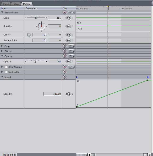
This was the finished result.

To create a more professional and aesthetically pleasing look to my video, i wanted to add a filter to change the tone of all the footage i hadn't already added filters to. To do this i used the mojo effect.


Here is an example of the effects of mojo, before and after.


Subscribe to:
Comments (Atom)